
Beyond Lighting Design: The History of QTL Told Through Logos
Before delving into the world of lighting products, QTL's founder, John Tremaine, had already developed a keen eye for design. John founded Tremaine Lighting and Design in 1980, followed by Primo that opened in 1985, a showroom and design studio of the most advanced lighting products from Europe and the US. Q-Tran was born in the basement of Primo in 1991 where he developed the first QTL products. His interest didn’t stop with lighting design; over the decades, John commissioned icons of graphic design to develop the company’s logos. These marks serve as a visual narrative, reflecting the company's rich journey.
PRIMO, 1985
Designed by Fred Troller
Fred Troller was hired to design the logo for the PRIMO lighting showroom. Troller had earned a reputation for popularizing the Swiss style of design, an aesthetic that appealed greatly to John.
“When Fred and I sat down to review his proposed design, he explained that he normally worked through several rounds of design edit with clients. However, in this case he believed he already had the final logo to present. I ask that he continue, and he turned a board over to expose this logo. I was blown away by the creative use of symmetrical images, and the color just popped. I instantly approved it. Years later, Paul Rand, the father of graphic design, came to Primo to select lighting for his new studio. He pointed at the logo and said that it was one of his most favorite works done by another designer,” shared John, who many years later learned that Paul Rand selected Fred to design his gravestone, a highly celebrated piece of graphic art.
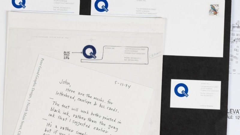
Q-TRAN, 1993
![]()
Designed by Peter Good
When John founded Q-Tran over 30 years ago, the company name was inspired by the toroid in the company's low-voltage power supply. The letter "Q" reflected quality, while "Tran" signified "transformer." On a deeper level, the Q-Tran name echoed the company's mission to transform the lighting industry through cutting-edge technology and superior quality. John reached out to Peter Good, designer of the famed Whalers and Special Olympic logos, for logo concepts.
“Peter only had one logo to show me. When he did, I instantly loved it and thought it was the most obvious resolution to what we needed. I appreciated the use of the perfectly round “Q” that resembled our toroid product, and the simple but creative insertion of “Tran” in the bar of the “Q” spoke to me. It said it all in a simple elegant manner,” John explained.
ENLIGHTENEDTHINKING, 1994

Designed by Peter Good
“Innovation is paramount in everything we do. Product design is at the very core of the company’s soul. This clever tagline captures that while giving a nod to lighting,” John reflects. “Peter didn’t come up with the tagline itself, but he did make it distinctive by making it one word, with ENLIGHTENED in bold face and THINKING in thin face.”
Q-TRAN LED, 2013
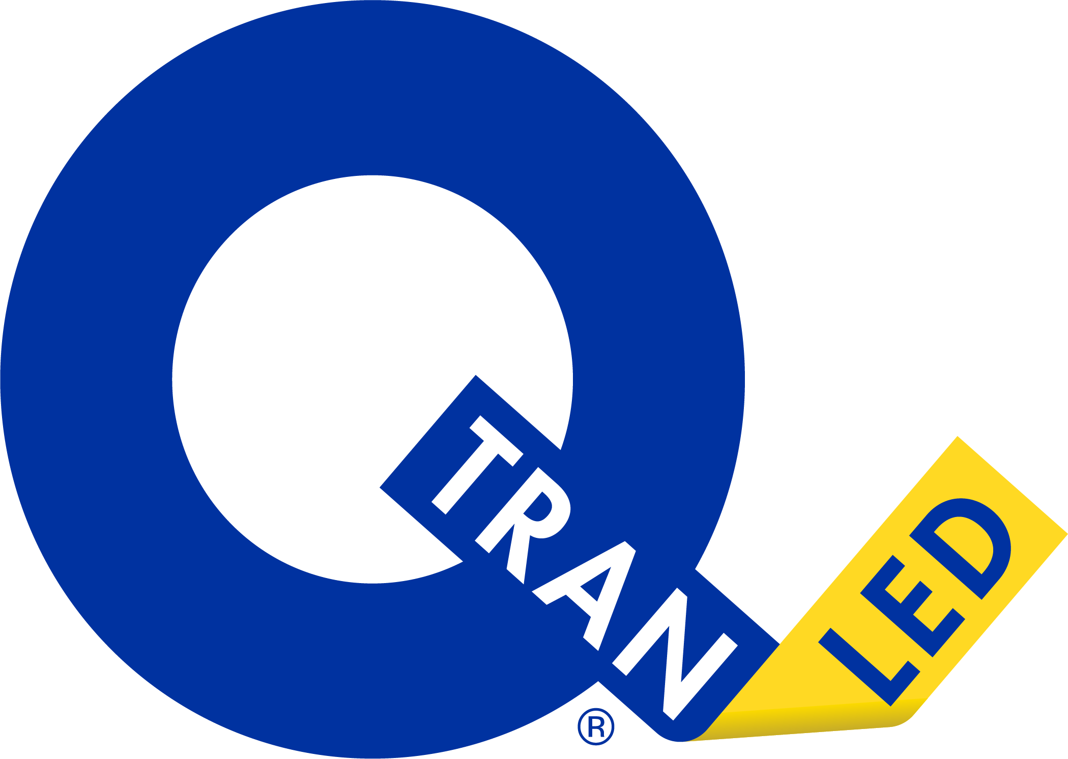
Designed by Peter Good
About twenty years later, Gean Tremaine led Q-Tran to expand its offering by including high-quality architectural LED strips and linear fixtures. This led to significant growth for the company, and LED lighting quickly became a larger source of revenue than power supplies.
Gean commented, “We felt that we needed to update the logo to reflect the fact we were in LED lighting as well. We presented this dilemma to Peter, who came up with a fold-over extension to the bar of the Q – like a Hershey’s Kiss tag.”
QTL, 2024
![]()
Designed by Nathan Garland
After more than a decade of designing and manufacturing LED products, the company had expanded into many new markets and verticals, fueled by the addition of flexible Q-CAP encapsulated fixtures, precision optics, performance fixtures, tiny MICRO5 products, and the recent acquisition of Excelsior, a landscape lighting company. Toroidal transformers, while still a respected part of the business, had become less representative of the company’s place in the market. Thus, QTL was born.
“We decided the Q-Tran brand no longer reflected the company we are today,” Gean declared. “QTL is an evolution of Q-Tran LED. We are still dedicated to providing the highest quality LED products, to innovation and remain trustworthy partners. However, we’ve grown far from the company Q-Tran started over 30 years ago, and we are continuing to grow. It was time for the brand to follow suit.”
Sadly, Peter Good passed away in 2023; therefore, John turned to another influential graphic designer: Nathan Garland, a Fulbright scholar, a graduate of the Yale School of Art, and close friend of Paul Rand. Nathan has been recognized as one of the top Connecticut graphic design legends.
“Once again, the moment I saw Nathan’s concept for the logo, I knew it was perfect. It preserves the iconic bold Q we’re known for,” mused John. “The way it incorporates the T and L within the Q, with the L being knocked out, creates an interplay of shadows and light. It has a timeless elegance and simplicity that will become recognized around the world in the years to come - it brought tears of joy to my eyes when Nathan introduced it to me.”
Gean added, “QTL is the next chapter for us. It represents who we are today while also allowing us the freedom to pursue new strategies in the future. We’re excited to show the world who QTL is.”
0 Comments: